Project Overview:
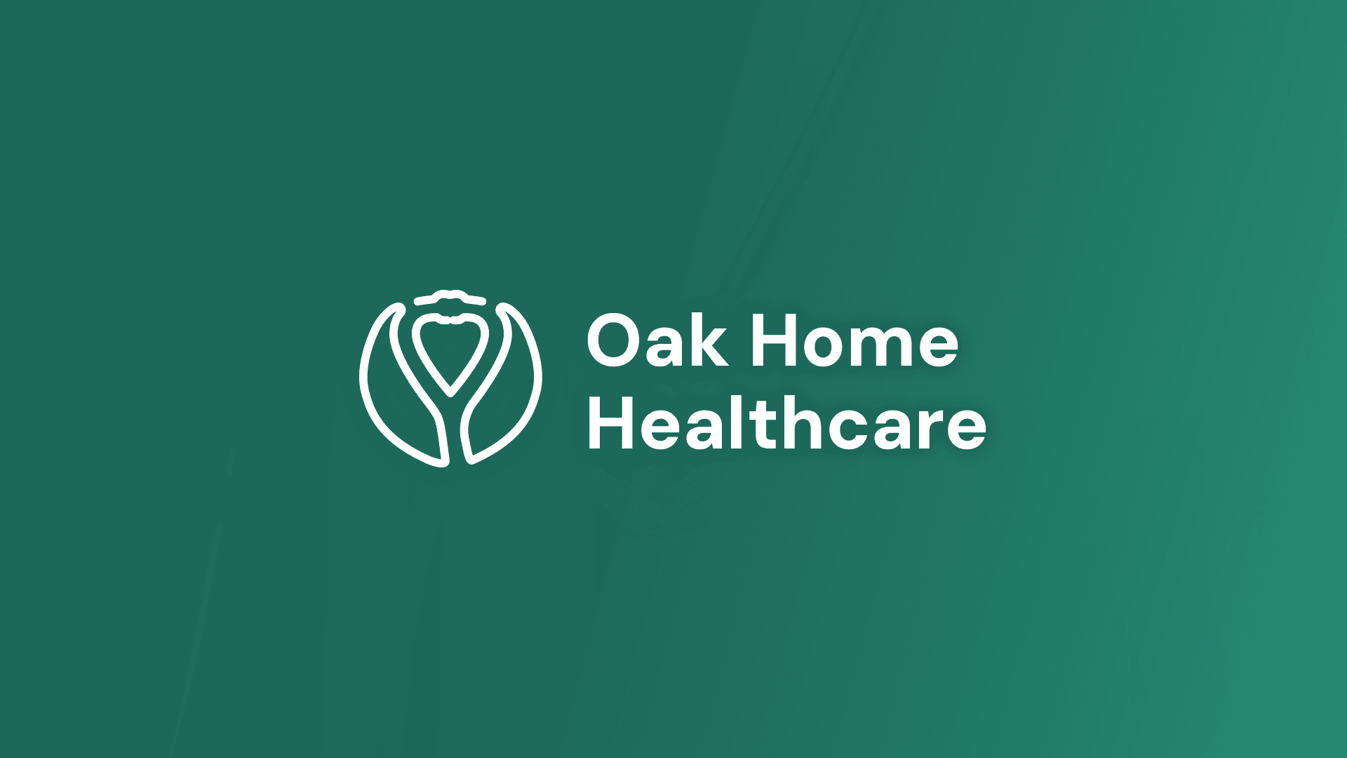
Oak Home Healthcare is a U.S.-based agency dedicated to providing compassionate, professional home healthcare for aging adults. Their mission is to help families keep loved ones comfortable at home while receiving the quality care they need. The client needed a visual identity that communicates trust, warmth, and reliability — but without leaning on the overused “house-shaped” healthcare logos common in the industry.
My Role:
Logo Design
Visual Identity System
Color Direction
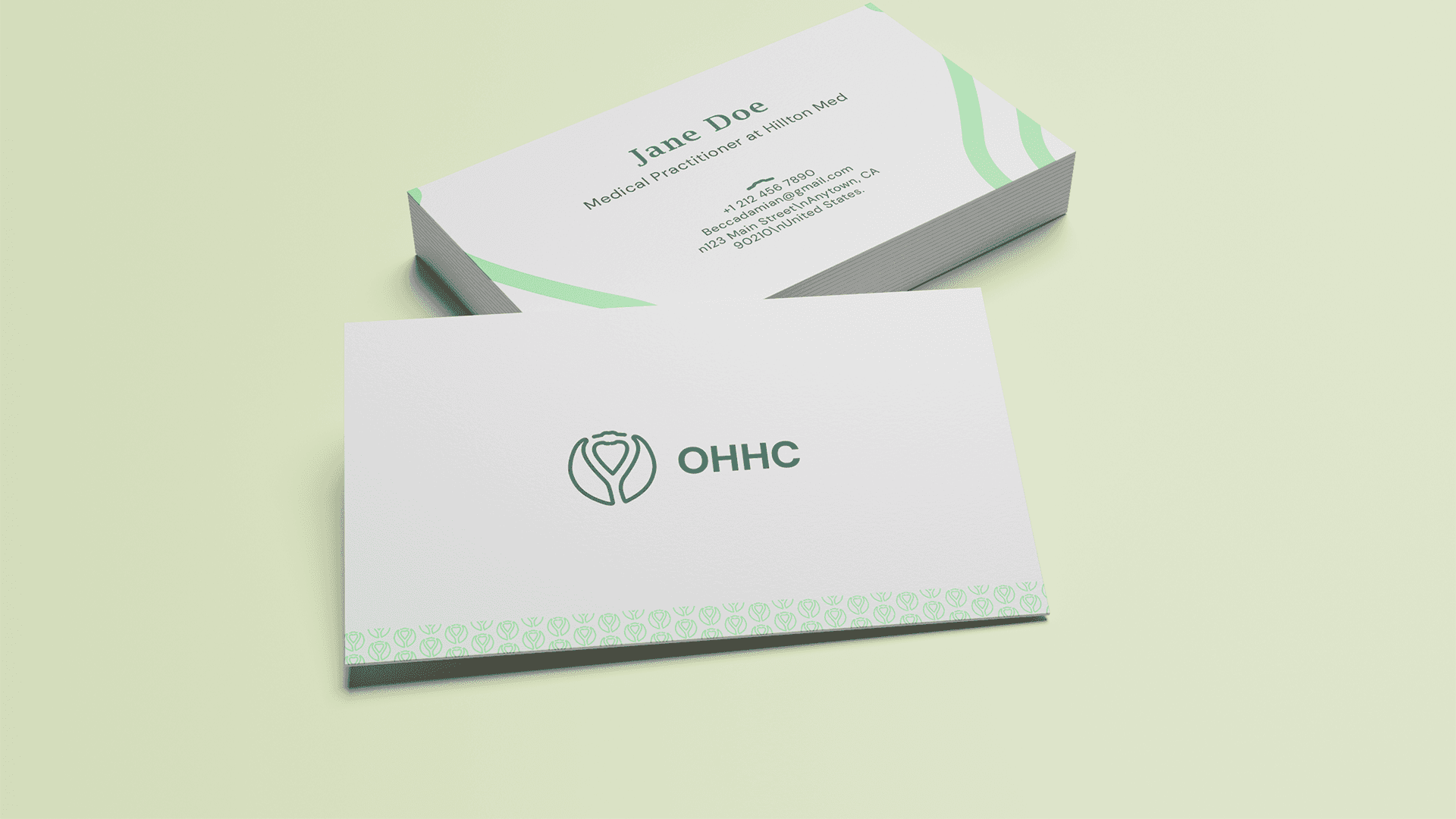
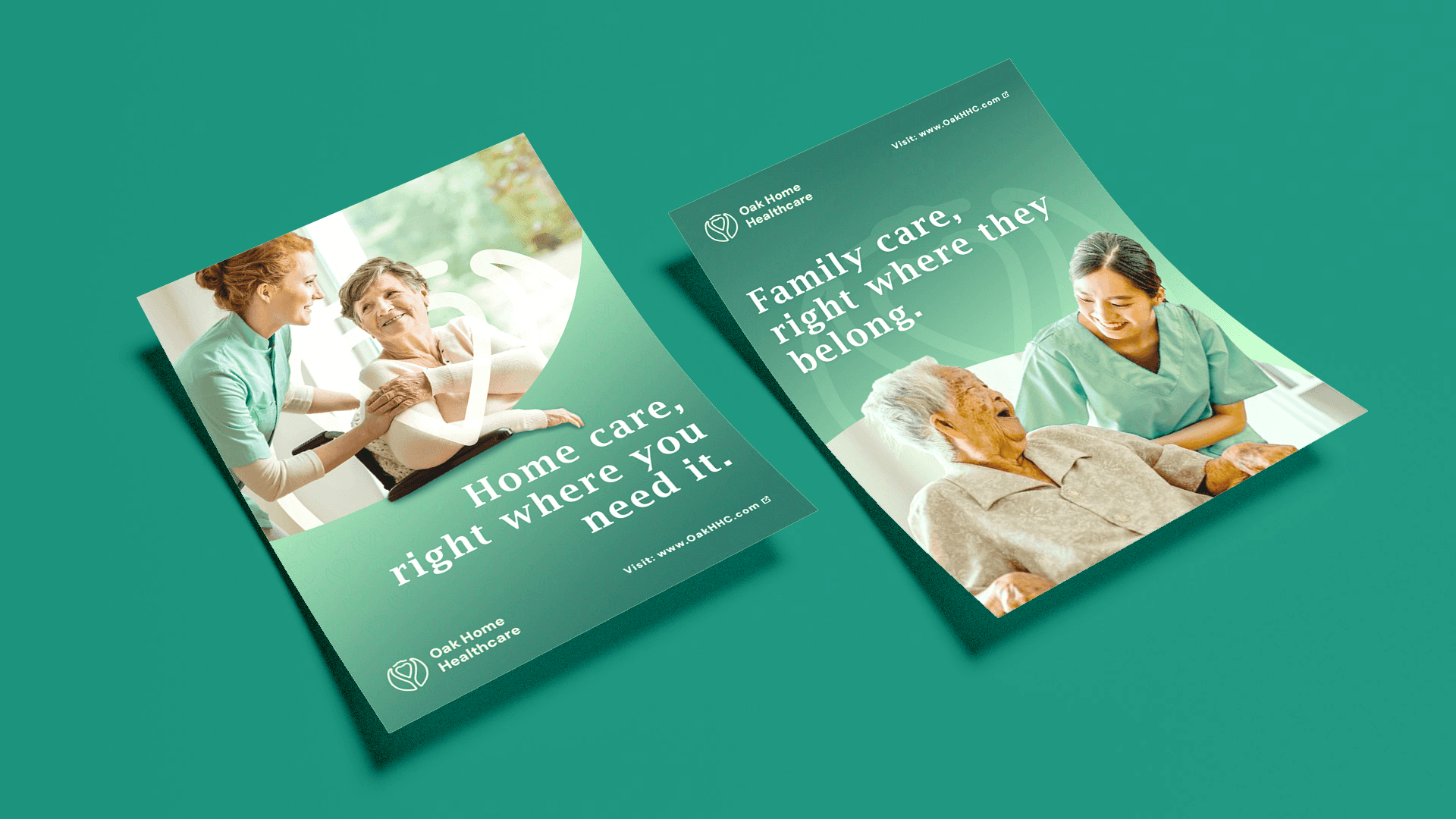
Business Card & Marketing Assets
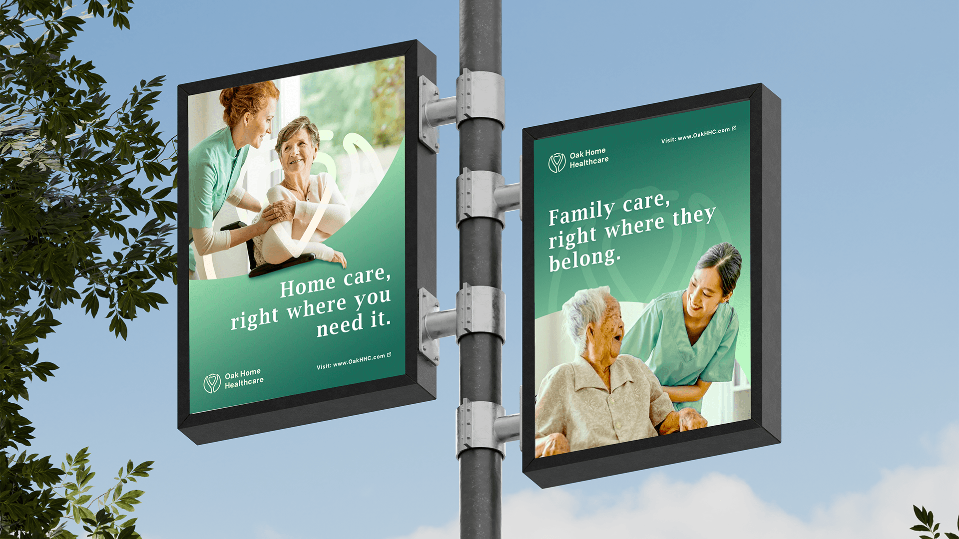
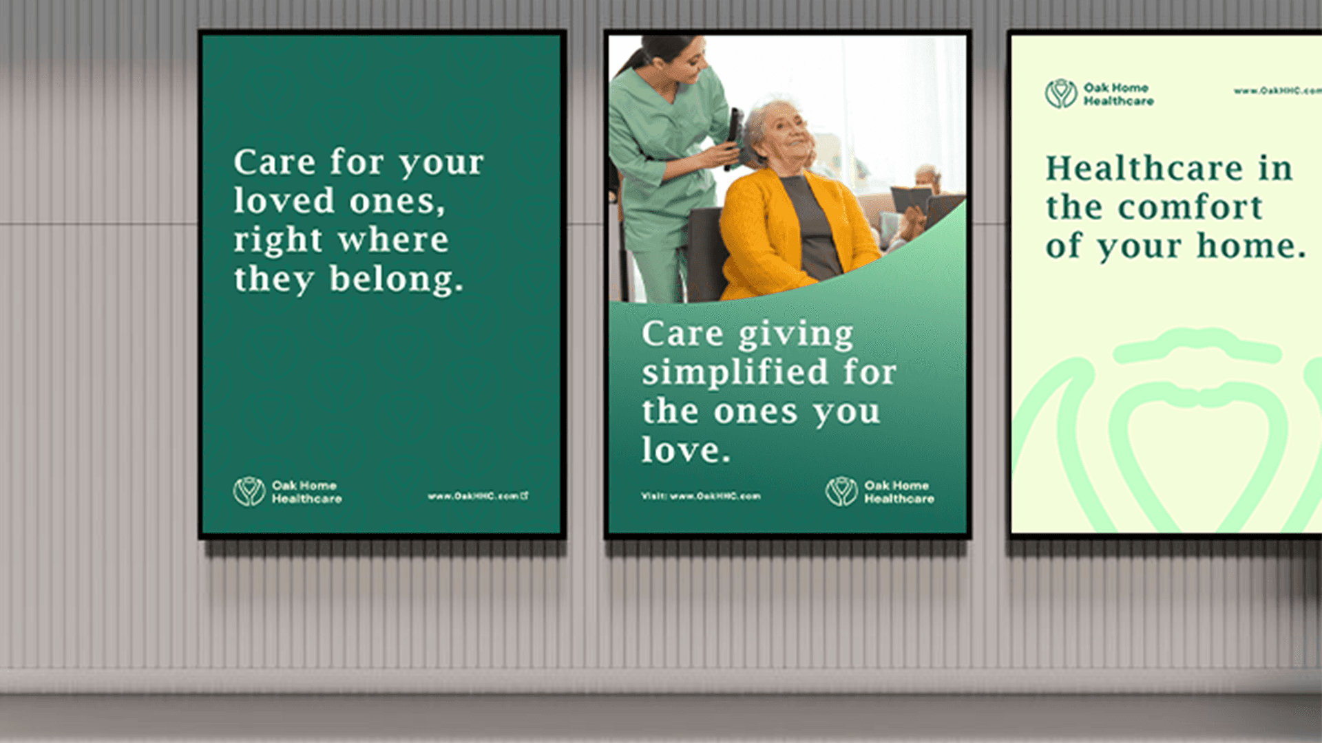
Presentation Mockups
The Challenge:
The biggest challenge was creating a brand identity that felt professional and credible for healthcare, while also warm and family-oriented. The design needed to resonate with relatives making care decisions, conveying both compassion and clinical reliability. It also had to scale seamlessly across business cards, billboards, and digital platforms.
The Solution:
I developed a clean, modern logo mark paired with approachable typography to reflect care and connection. The color palette centered on greens and neutrals, evoking trust, growth, and calmness. Supporting visuals were designed with simplicity and clarity in mind, ensuring the identity remained versatile and memorable.
Results:
The final identity positions Oak Home Healthcare as both professional and approachable, bridging the gap between medical expertise and family-centered compassion. From business cards to billboards, the system communicates the brand’s promise clearly: “Care for your loved ones, right at home.”